Mobile Game / EdTech
Be Finance Fluent (BFF)
A gamified mobile learning game teaching business finance to university students — covering game screens, mascot system, character design and animation.
Role
Lead Product & UX Designer
Client
Wealthvox × Aston University
Team
SOC

The Problem
BFF had strong educational content but nothing to make learners come back. No narrative, no reward system, no mascot, no visible sense of progress. Users completed a task and left.
The brief : redesign the full game experience from the ground up — a narrative arc across three levels, a mascot system that worked as a guide and emotional anchor, all screens from splash to level completion, and a locked handoff document that could go directly to development.
My Role
Full product design across the game — auditing existing screens, defining the gamification architecture, designing all screens, building the mascot system, designing and animating characters across all three levels, and producing the Screen-by-Screen Design Document as the single source of truth for development.
Design Process
Stakeholder
Alignment
Heuristic
Audit
Competitive
Benchmarking
(Duolingo · Noom)
IA & Flow
Design
Wireframs,
Lo-Fi Ideation &
Hi-Fi Screen
Design
Mascot &
Character
Design
Character
Animation
Design Lock
& Handoff
Heuristic Audit

AI Assisted Competitive Benchmarking across Duolingo and Noom — identifying the most relevant gamification patterns and translating them directly into BFF's design architecture before any screens were drawn.
Competitive Benchmarking (Duolingo · Noom)


IA & Flow Design


Wireframs, Lo-Fi Ideation


Hi-Fi Ideation


Mascot & Character Design


Character personality directions and visual identity were iterated with AI — exploring multiple mascot concepts quickly before committing to the Acorn direction.
Animations


One non-negotiable was established early: the narrative was the backbone, not a feature. Every screen decision was tested against the core story — the player is building their own accountancy practice, and the world around them grows to reflect that.
Key Design Challenges
01
Making accounting feel like a game worth playing The design challenge wasn't decoration — it was architecture. XP on every screen, a strict linear unlock system, a visible journey map, and a long-term reward that accumulates across the arc. The content didn't change. The frame around it did.
02
Linear progression that feels like anticipation, not a wall The current month is fully open and generously signposted. Future months are visible but quietly greyed out. The lock is never the focus of the screen. Progress is.
03
The game is a growth story. The player starts small, builds knowledge month by month, and becomes something bigger by the end. The mascot needed to reflect that — not just react to it.
The solution was the Acorn. A small, illustrated character that begins the game as a literal acorn — modest, early-stage, full of potential — and evolves into a Plant when Level 2 unlocks, and an Oak Tree when Level 3 unlocks. The mascot doesn't just accompany the player. It mirrors them.
Acorn fully designed. Plant and Oak Tree in progress alongside Levels 2 and 3.
04
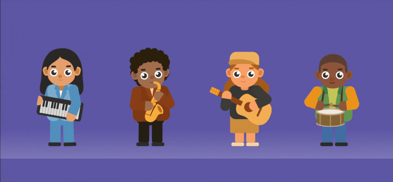
Characters inclusive by intent Diversity across ethnicity, gender, and background was a design requirement, not an afterthought — stereotypes were to be actively broken. Four musician friends in Level 1, four tech company CEOs in Level 2, twelve sector clients across Level 3. All characters were designed with distinct personalities and animated to bring them to life.
05
A handoff document that could survive without me Game design's most common failure mode: the designer leaves, the developer interprets, the product ships differently. Every screen in the document had a defined mascot state, dialogue, UI element list, and navigation rule. An explicit lock statement was included
06
The main gameplay screen had to fit a balance sheet, income statement, transaction log, and controls on a single mobile screen — without losing readability.
10px was established as the hard floor for text size. Anything smaller was reconsidered — grouped, reorganised, or given more visual weight to compensate.
Colour did the rest. With assets, liabilities, equity, income, and expenses all on screen simultaneously, colour wasn't decoration
— it was the primary navigation tool. Each category needed a distinct, accessible colour that worked at small sizes without creating visual noise.
The Product


Gameplay screens withheld pending product launch.
AI in my Workflow
Research Synthesis
Hours of stakeholder recordings extracted into structured design decisions quickly
Benchmarking
Duolingo and Noom patterns identified and translated directly into BFF's architecture
Layout Exploration
Screen layout directions explored and iterated with AI before committing
Character & Mascot
Personality and visual directions explored with AI before committing to illustration
Dialogue & Copy
Mascot narration scripts and UI copy across 10+ screen contexts generated and refined
UI Copy
Screen-level copy balancing educational clarity with a playful voice
AI accelerated research, exploration, and writing — all final design decisions, visual direction, and system thinking remained my own.
Where It Stands
Design complete and locked. Handoff document delivered to development as the single source of truth. The game is live on Google Play as an early testing build ahead of official launch — currently in structured testing with Aston University students, with the metrics framework below set to evaluate engagement, usability, and learning outcomes before the full release.
The Office upgrade system is in active design and development. When the product officially launches, it replaces a finance education experience with no emotional pull with one built around narrative, progression, and habit formation.
Testing & Metrics
(Framework set ahead of early testing with Aston University students)
The primary question this testing phase answers: are students coming back? Engagement is the leading indicator for everything else — a student who returns is a student who is learning. The metrics framework is structured around that priority, with usability and learning outcome data used to diagnose what is driving or limiting engagement.
Engagement — Primary
These are the metrics that matter most to the product's success.
Return rate — percentage of students who return to play a second session after completing Month 1. Target: 60%+
Level completion rate — percentage of students who complete all 12 months of Level 1. Drop-off points identify where engagement breaks
Session length — average time spent per session. Benchmark: 15–20 minutes, consistent with Duolingo's engagement model
Daily active usage — how many students play on consecutive days. Streaks and XP system effectiveness measured here
Stage drop-off rate — which of the four stages loses the most players. Identifies the weakest point in the monthly loop
Usability — Diagnostic
Usability problems directly cause engagement drop. These metrics explain where and why students disengage.
Task completion rate — can students complete each stage without getting stuck. Target: 85%+
Error rate per stage — how often students make incorrect interactions before completing a stage
Time on task — how long each stage takes relative to expected completion time. Outliers signal confusion
Navigation confusion points — screens where students pause, backtrack, or exit unexpectedly
Learning Outcomes — Diagnostic
Learning progress reinforces engagement. Students who feel they are improving are more likely to return.
Pre and post quiz scores — knowledge assessment before and after Level 1. Target: measurable improvement
Stage 4 quiz accuracy — correct answer rate on the monthly quiz. Tracks concept retention month on month
Score improvement across months — does accuracy improve as students progress through the 12 months


